Introduction
Different from the traditional diffusion research, network diffusion research focuses on how network structure exerts its impact on the diffusion process. In this post, I present how to simulate the most simple network diffusion with R.
As the first step, the algorithm is quite simple:
- Generate a network g: g(V, E).
- Randomly select one or n nodes as seeds.
- Each infected node influences its neighbors with probability p (transmission rate, ).
SI model
Actually, this is the most basic epidemic model (SI model) which has only two states: Susceptible (S) and Infected (I). However, we will extend it to networks.
SI model describes the status of individuals switching from susceptible to infected. In this model, every individual will be infected eventually. Considering a close population without birth, death, and mobility, and assuming that each agent is homogeneous mixing, SI model implies that each individual has the same probability to transfer the something (e.g., disease, innovation or information) to its neighbors (T. G. Lewis, 2011).
Given the transmission rate , SI model can be described as:
Note that I + S = 1, the equation can be simplified as:
Solve this equation, we can get a logistic growth function featured by its s-shaped curve. The logistic curve increases fast after it crosses the critical point, and grows much slower in the late stage. It can be used to fit the curve of diffusion of innovations.
Note that the SI model is quite naive. In the real case of epidemic spreading, we have to consider how the status of the infected change: the infected can recover and become susceptible again (SIS model), or the infected can recover and get immune (SIR, denotes the removal or recovery rate).
In this post, I intend to bring the network back into the simulation of SI model using R and the package igraph.
Generate the network
require(igraph)
# generate a social graph
size = 50
# regular network
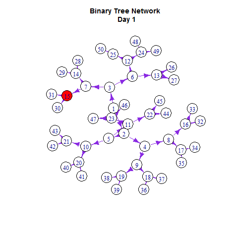
g = graph.tree(size, children = 2); plot(g)
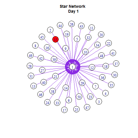
g = graph.star(size); plot(g)
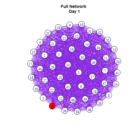
g = graph.full(size); plot(g)
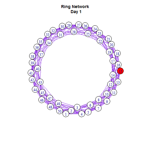
g = graph.ring(size); plot(g)
g = connect.neighborhood(graph.ring(size), 2); plot(g) # 最近邻耦合网络
# random network
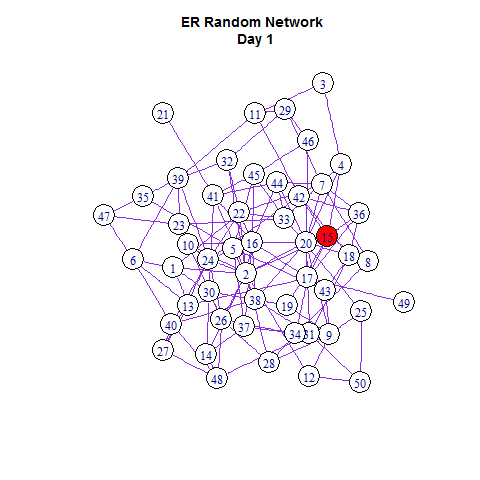
g = erdos.renyi.game(size, 0.1)
# small-world network
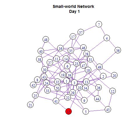
g = rewire.edges(erdos.renyi.game(size, 0.1), prob = 0.8 )
# scale-free network
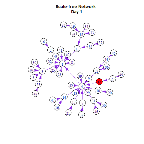
g = barabasi.game(size) ; plot(g)
Initiate the diffusers
seeds_num = 1
set.seed(2014); diffusers = sample(V(g),seeds_num) ; diffusers
infected =list()
infected[[1]]= diffusers
# for example, set percolation probability
p = 0.128
coins = c(rep(1, p*1000), rep(0,(1-p)*1000))
n = length(coins)
sample(coins, 1, replace=TRUE, prob=rep(1/n, n))
Update the diffusers
# function for updating the diffusers
update_diffusers = function(diffusers){
  nearest_neighbors = neighborhood(g, 1, diffusers)
  nearest_neighbors = data.frame(table(unlist(nearest_neighbors)))
  nearest_neighbors = subset(nearest_neighbors, !(nearest_neighbors[,1]%in%diffusers))
  # toss the coins
  toss = function(freq) {
    tossing = NULL
    for (i in 1:freq ) tossing[i] = sample(coins, 1, replace=TRUE, prob=rep(1/n, times=n))
    tossing = sum(tossing)
    return (tossing)
  }
  keep = unlist(lapply(nearest_neighbors[,2], toss))
  new_infected = as.numeric(as.character(nearest_neighbors[,1][keep >= 1]))
  diffusers = unique(c(diffusers, new_infected))
  return(diffusers)
  }
Start the contagion!
R you Ready? Now we can start the contagion!
i = 1
while(length(infected[[i]]) < size){
  infected[[i+1]] = sort(update_diffusers(infected[[i]]))
  cat(length(infected[[i+1]]), "\n")
  i = i + 1
}
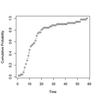
Let’s look at the diffusion curve first:
# "growth_curve"
num_cum = unlist(lapply(1:i, function(x) length(infected[x]) ))
p_cum = num_cum/max(num_cum)
time = 1:i
png(file = "./temporal_growth_curve.png",
	width=5, height=5,
	units="in", res=300)
plot(p_cum~time, type = "b")
dev.off()
To visualize the diffusion process, we label the infected nodes with the red color.
E(g)$color = "blueviolet"
V(g)$color = "white"
set.seed(2014); layout.old = layout.fruchterman.reingold(g)
V(g)$color[V(g)%in%diffusers] = "red"
plot(g, layout =layout.old)
I make the animated gif using the package animation developed by Yihui Xie.
library(animation)
saveGIF({
  ani.options(interval = 0.5, convert = shQuote("C:/Program Files/ImageMagick-6.8.8-Q16/convert.exe"))
  # start the plot
  m = 1
  while(m <= length(infected)){
    V(g)$color = "white"
    V(g)$color[V(g)%in%infected[[m]]] = "red"
    plot(g, layout =layout.old)
    m = m + 1}
})
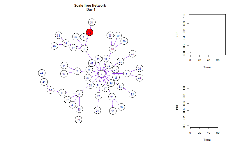
Similar to Netlogo (a software used for agent-based modeling), we can monitor the dynamic diffusion process with multiple plots.
saveGIF({
  ani.options(interval = 0.5, convert = shQuote("C:/Program Files/ImageMagick-6.8.8-Q16/convert.exe"))
  # start the plot
  m = 1
  while(m <= length(infected)){
    # start the plot
    layout(matrix(c(1, 2, 1, 3), 2,2, byrow = TRUE), widths=c(3,1), heights=c(1, 1))
    V(g)$color <- "white"
    V(g)$color[V(g)%in%infected[[m]]] = "red"
    num_cum = unlist(lapply(1:m, function(x) length(infected[[x]]) ))
    p_cum = num_cum/size
    p = diff(c(0, p_cum))
    time = 1:m
    plot(g, layout =layout.old, edge.arrow.size=0.2)
    title(paste("Scale-free Network \n Day", m))
    plot(p_cum~time, type = "b", ylab = "CDF", xlab = "Time",
         xlim = c(0,i), ylim =c(0,1))
    plot(p~time, type = "h", ylab = "PDF", xlab = "Time",
         xlim = c(0,i), ylim =c(0,1), frame.plot = FALSE)
    m = m + 1}
}, ani.width = 800, ani.height = 500)
Based on this post, I made slides using Rpres in Rstudio, you can view it following this link.